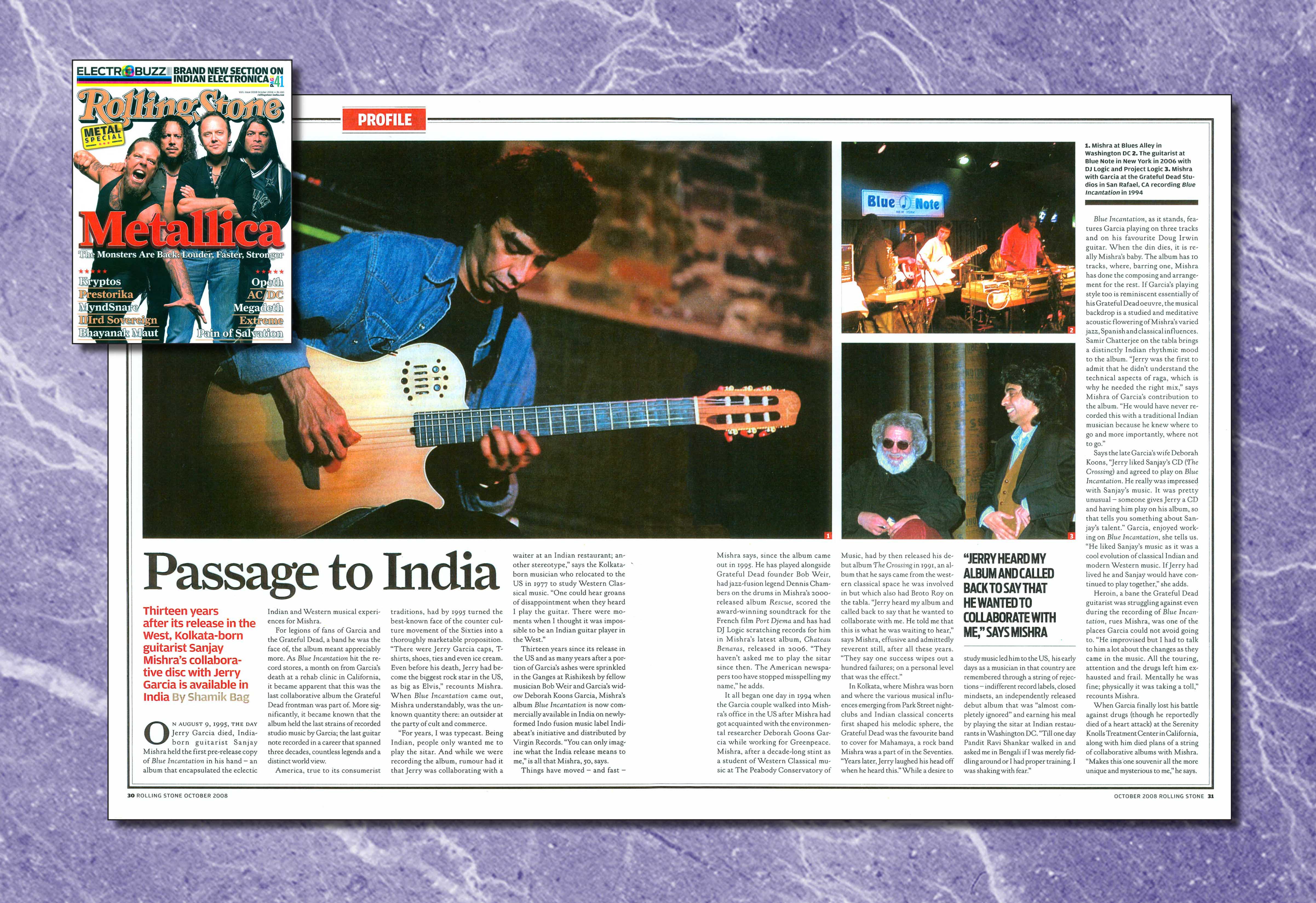
Like this feature article here, it uses 3 images. Seeing as I have many images of my model in one location, I can use a layout such as this one to make the most of the images I have taken.
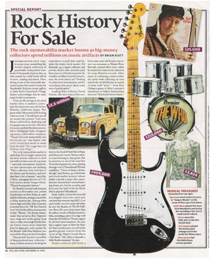
 On the other hand, the Rolling Stone feature article on the left, shows how one image is used. The text to image ratio is significantly more, focusing on content as oppose to pictures. I plan to do the opposite such as the one below.


This feature article featured in Kerrang, is very unconventional in style. The colours, columns and background is all unconventional and is something I'd want to incorporate into my own work. Firstly, something traditionally kept is the three colour rule. The three colours being white, yellow and black, which all compliment each other and do not clash with the background.
It caught my eye the most out of all the feature articles I looked at, as the the use of spacing and layout was all different to the traditional magazine.
Like my image here to the right, it is also in the park. So either mimicking a similar eery effect, or playing the opposite of using opposite colours to bring an upbeat positive effect to my image.
Her rebellious look in this picture is also captivating.
Similar to the Kerrang feature article, perceiving them as rebels since playing in the woods is very unconventional.
 I could also follow the concept of the article, and write about my artist's story.
The only downside however, in using this image as my feature article, would be that she is quite central in the image. This therefore means that either part of her body and head, would be cut straight down the middle due to the fold line.
In order to use this image, I would have to alter the photo to fit her into the right hand side. This will create a blank rectangle to the left, and I can possibly overcome that by inputting a coloured border with text. (see image on right).

No comments:
Post a Comment