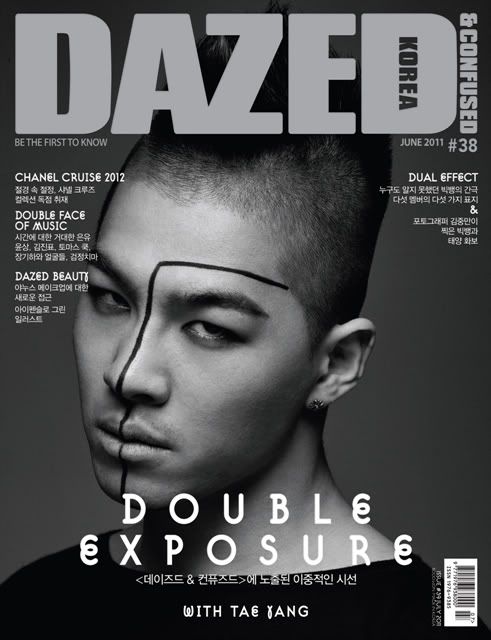
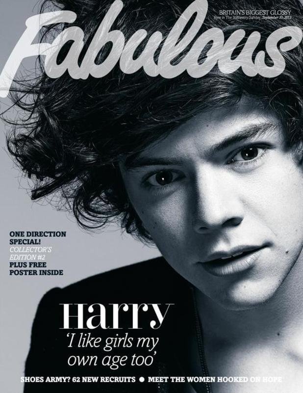
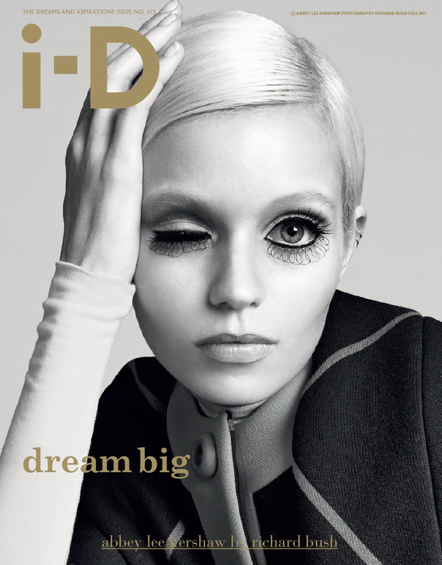
Using conventions of Kerrang's feature article, I mocked up this feature article.
Tuesday, 26 February 2013
Feature Article Research
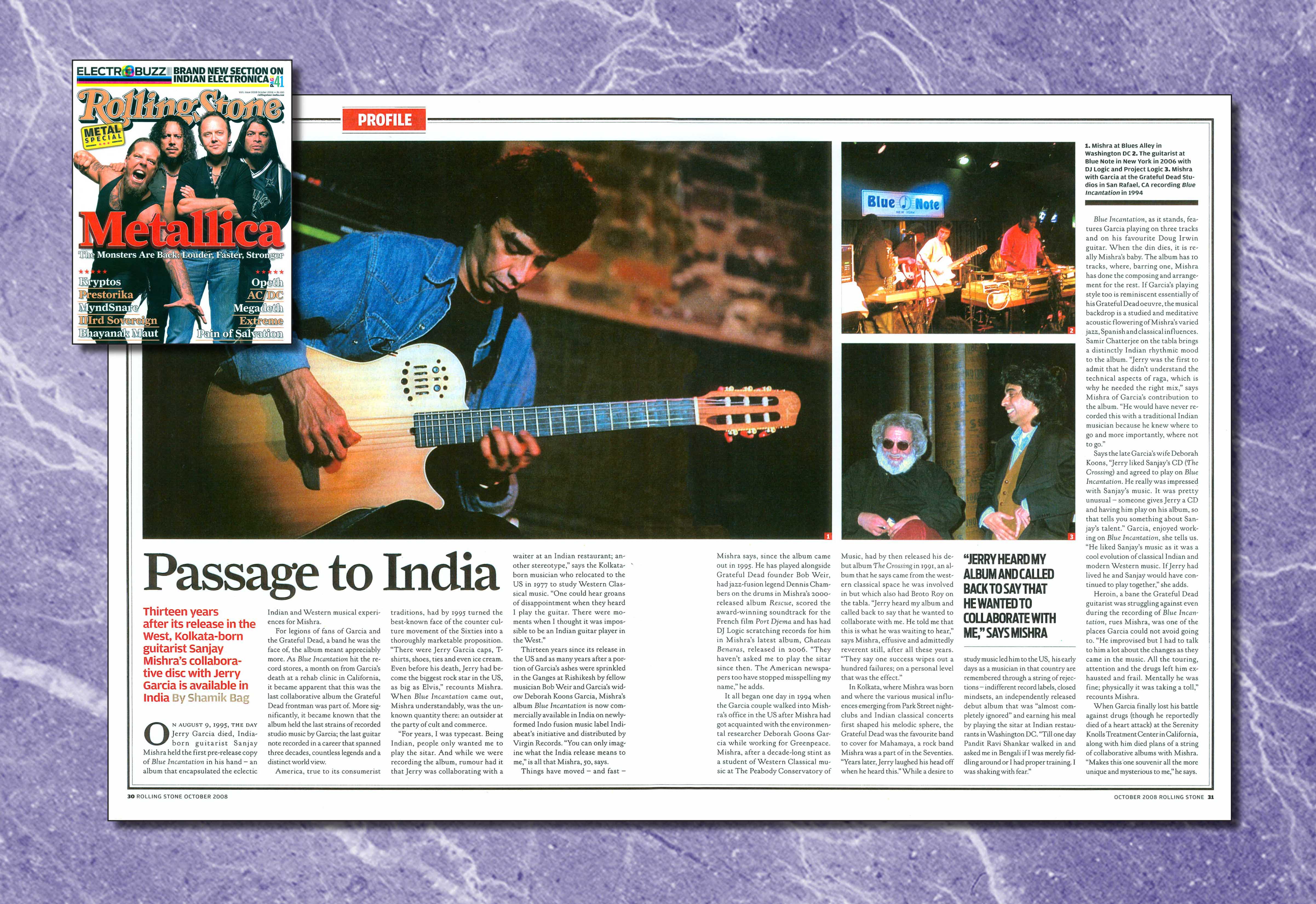
Like this feature article here, it uses 3 images. Seeing as I have many images of my model in one location, I can use a layout such as this one to make the most of the images I have taken.
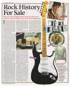
 On the other hand, the Rolling Stone feature article on the left, shows how one image is used. The text to image ratio is significantly more, focusing on content as oppose to pictures. I plan to do the opposite such as the one below.



This feature article featured in Kerrang, is very unconventional in style. The colours, columns and background is all unconventional and is something I'd want to incorporate into my own work. Firstly, something traditionally kept is the three colour rule. The three colours being white, yellow and black, which all compliment each other and do not clash with the background.
It caught my eye the most out of all the feature articles I looked at, as the the use of spacing and layout was all different to the traditional magazine.
Like my image here to the right, it is also in the park. So either mimicking a similar eery effect, or playing the opposite of using opposite colours to bring an upbeat positive effect to my image.
Her rebellious look in this picture is also captivating.
Similar to the Kerrang feature article, perceiving them as rebels since playing in the woods is very unconventional.
 I could also follow the concept of the article, and write about my artist's story.
The only downside however, in using this image as my feature article, would be that she is quite central in the image. This therefore means that either part of her body and head, would be cut straight down the middle due to the fold line.
In order to use this image, I would have to alter the photo to fit her into the right hand side. This will create a blank rectangle to the left, and I can possibly overcome that by inputting a coloured border with text. (see image on right).
Sunday, 24 February 2013
Rolling Stone
Rolling Stone is a magazine known for its ' traditional mix of content'. Due to the lack of indie magazines on the market, trying to identify one to mimic was difficult. Since Rolling Stone features many varying artists, the need to re shoot in order to fit the criteria of a music mag was not needed.
An example of this would be Taylor Swift. Who like my artist, is also a guitarist. 

 From Acoustic, to Hip-Hop and powerful black and white Pop covers, this will allow me to mimic a magazine, which is broad in genre but still artful in its own way.
I had a fifth photoshoot, in regards to the new magazine to consider. By using Rolling Stone's 2011 April 14th issue of Rihanna, I was able to use the similarities between the two of them to my advantage. By picking out the similarities between the two of them, such as the curly hair on both of them, where I also positioned her hair similarly as Rihanna's (hair covers a bit of one eye) and with the similar skin tones, I was able to photoshop her glow as a selling point towards the readers. By doing this for my magazine, I hopefully will be able to create a successful magazine by mimicking the conventions of this issue. I will focus on how Rihanna is presented, how light is focused on her, and I will evidently show that through my own work.
So far following the shoot, I have an altered image on the left (original on the right), where similar to Rihanna, used her curly hair to cover one eye. Also, the shot from eye-level to capture the emotion of my artist will help convey what my feature will be about. The red background is still a consideration, as like Rihanna's cover, red is shown to maybe present danger or lust. The clothing I had picked out all compliment each other, and when I come to do my market research, find that it does not go well, the red background will be used to easily photoshop her into a different background or colour.

Possible layout for my contents page.
Sunday, 3 February 2013
Subscribe to:
Comments (Atom)


